Flagship Minerals
Logo | Branding | Campaign | Digital | Social | Print
Having previously worked with Pan Asia Metals, I was approached to lead the rebrand as the company transitioned to its new identity: Flagship Minerals. The objective was to create a bold, impactful, and visually distinctive brand that would stand out in the traditionally conservative mining and resources sector. The new identity needed to reflect the company’s evolving vision while signalling confidence, energy, and a fresh presence in the industry. From visual strategy to execution, the focus was on building a brand that was both memorable and meaningful.
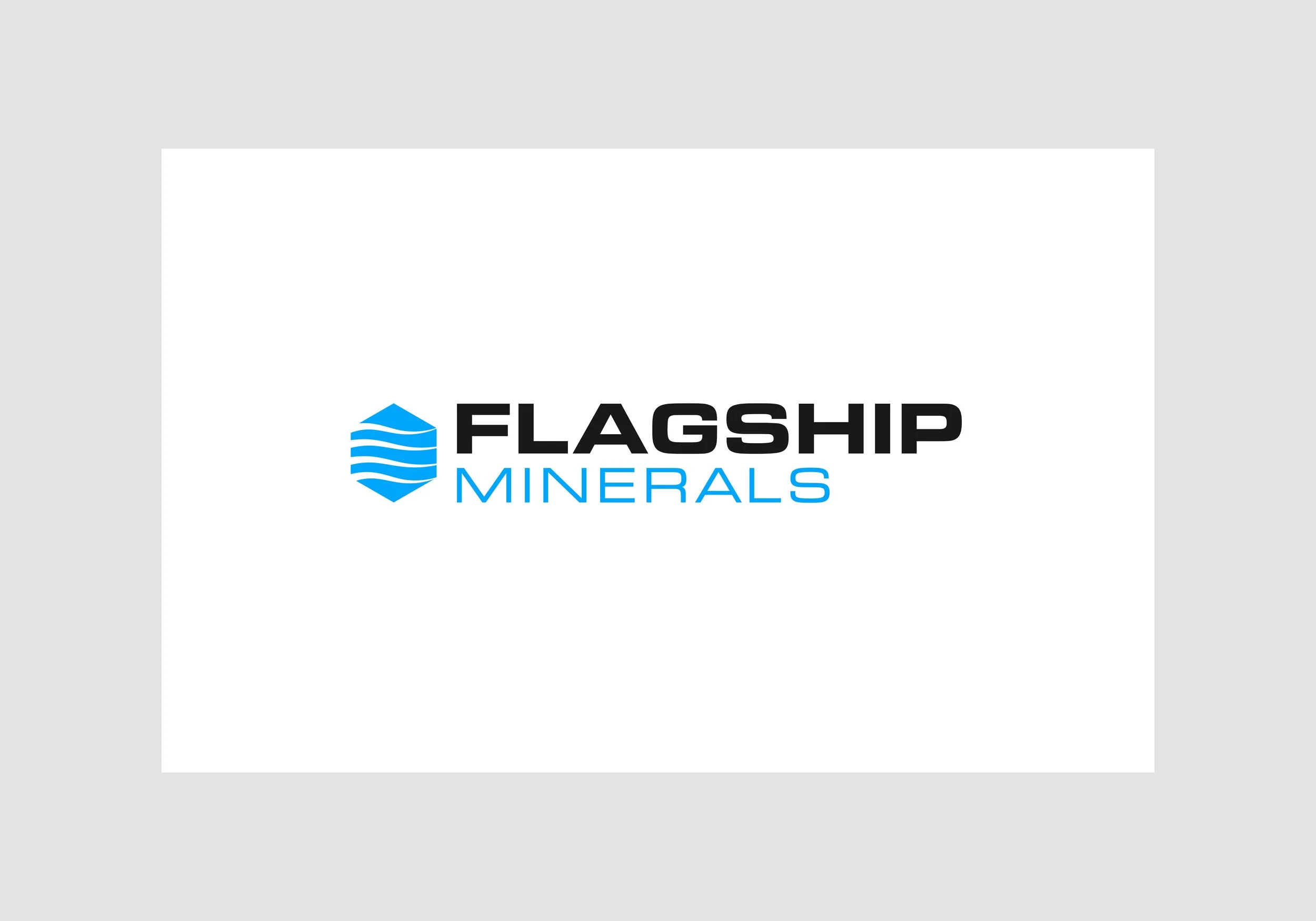
To reflect the client’s desire for a bold, strong identity, I used Eurostile for its industrial, confident feel. A hexagon symbolises mineral structures—conveying strength and stability—while horizontal wave lines suggest both geological layers and a flag, representing foundation and unity.
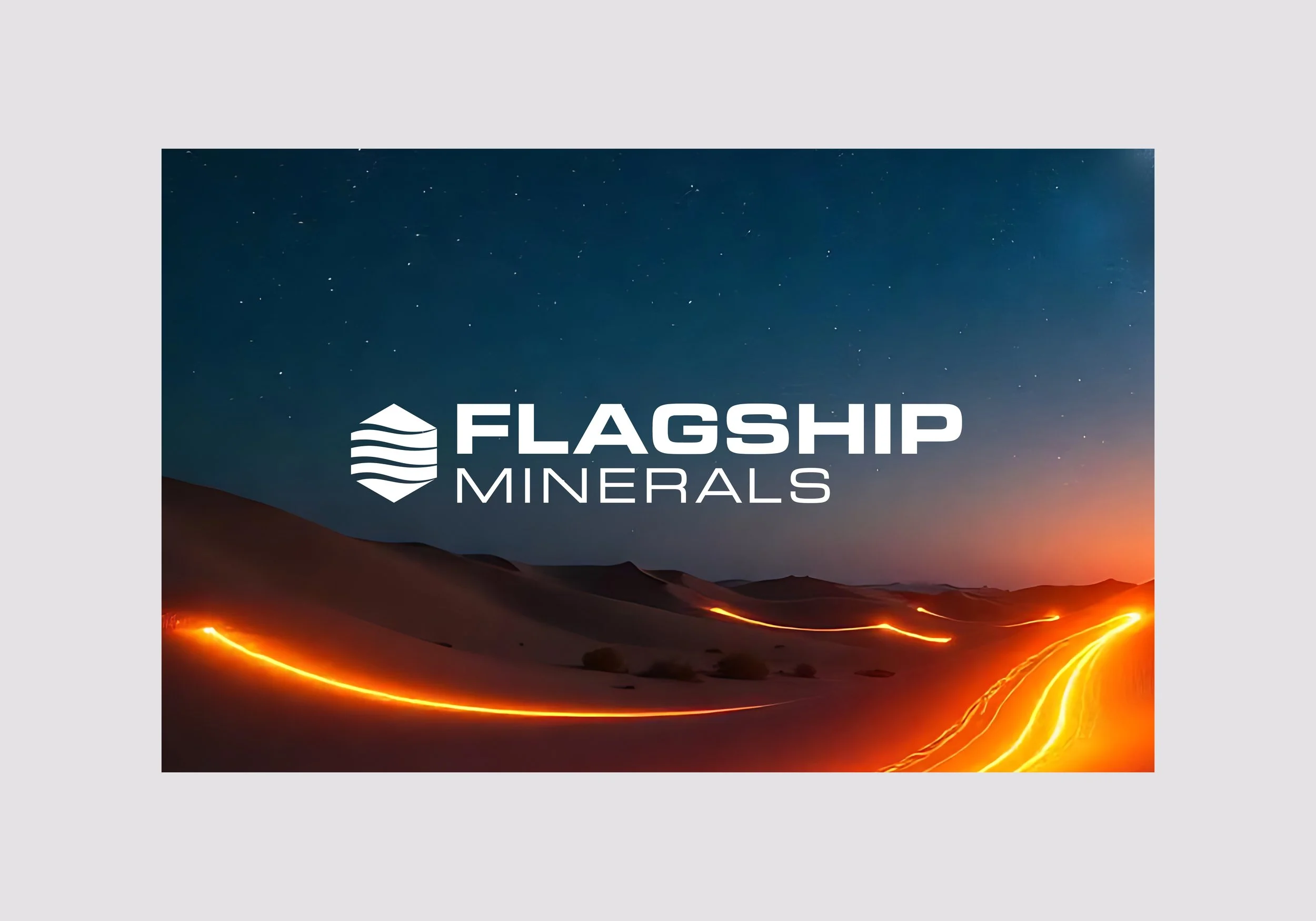
The reversed logo works seamlessly across imagery and colour blocks, maintaining clarity, impact, and strong brand presence in any setting.
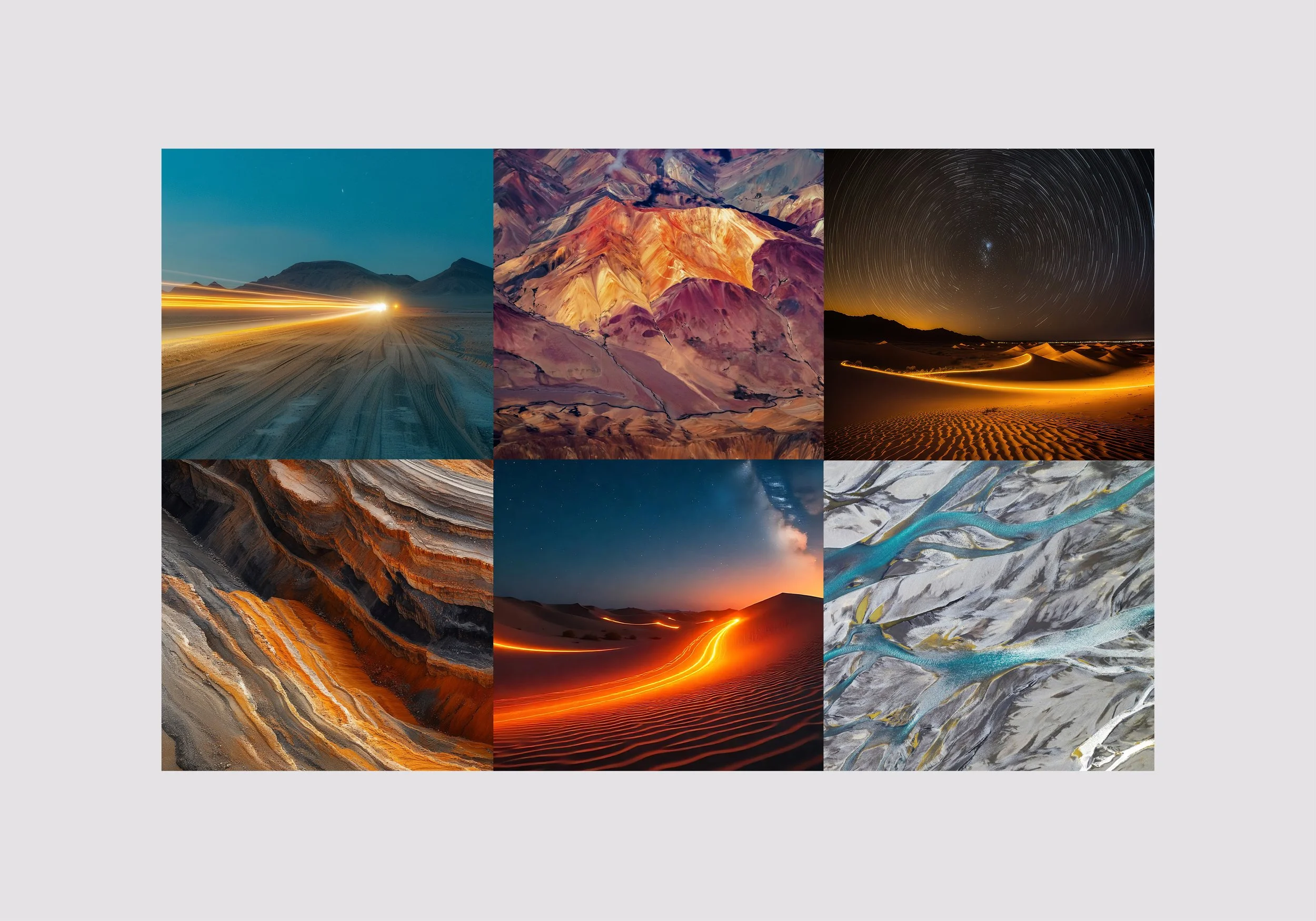
By using macro landscape photography, the brand breaks away from conventional industry visuals such as trucks and mine sites. These shots are mixed with innovative imagery, like light beams sweeping across vast terrains, to symbolise Flagship Minerals pioneering spirit and its role in uncovering the critical metals that power the electric future.
Hexagon patterns were designed to frame imagery, enhance visual impact, and reinforce the core brand graphic across materials. Bold, vibrant colours were introduced to deliver a strong and memorable brand presence.
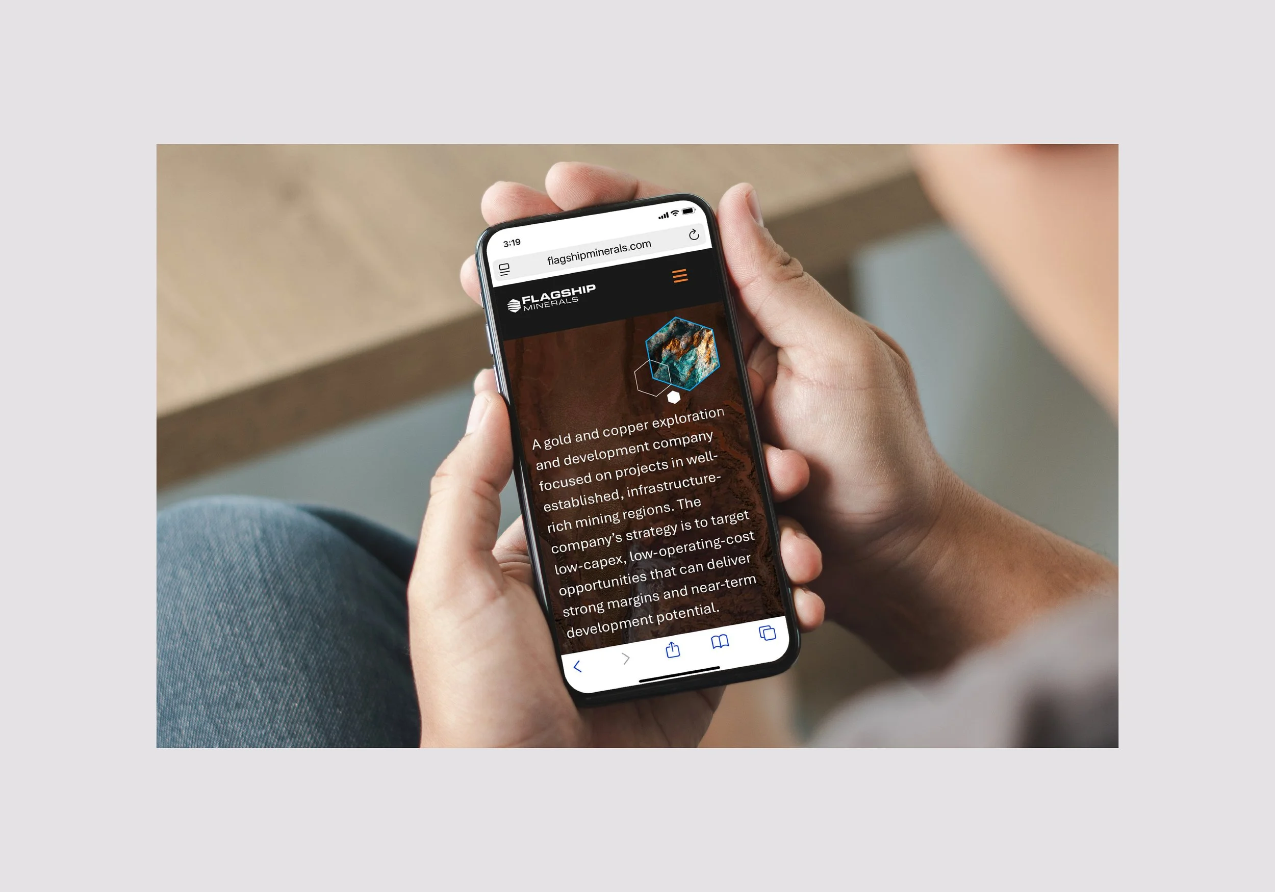
The Flagship Minerals website brings the brand to life with a modern, forward-thinking identity. (Click image to visit site)
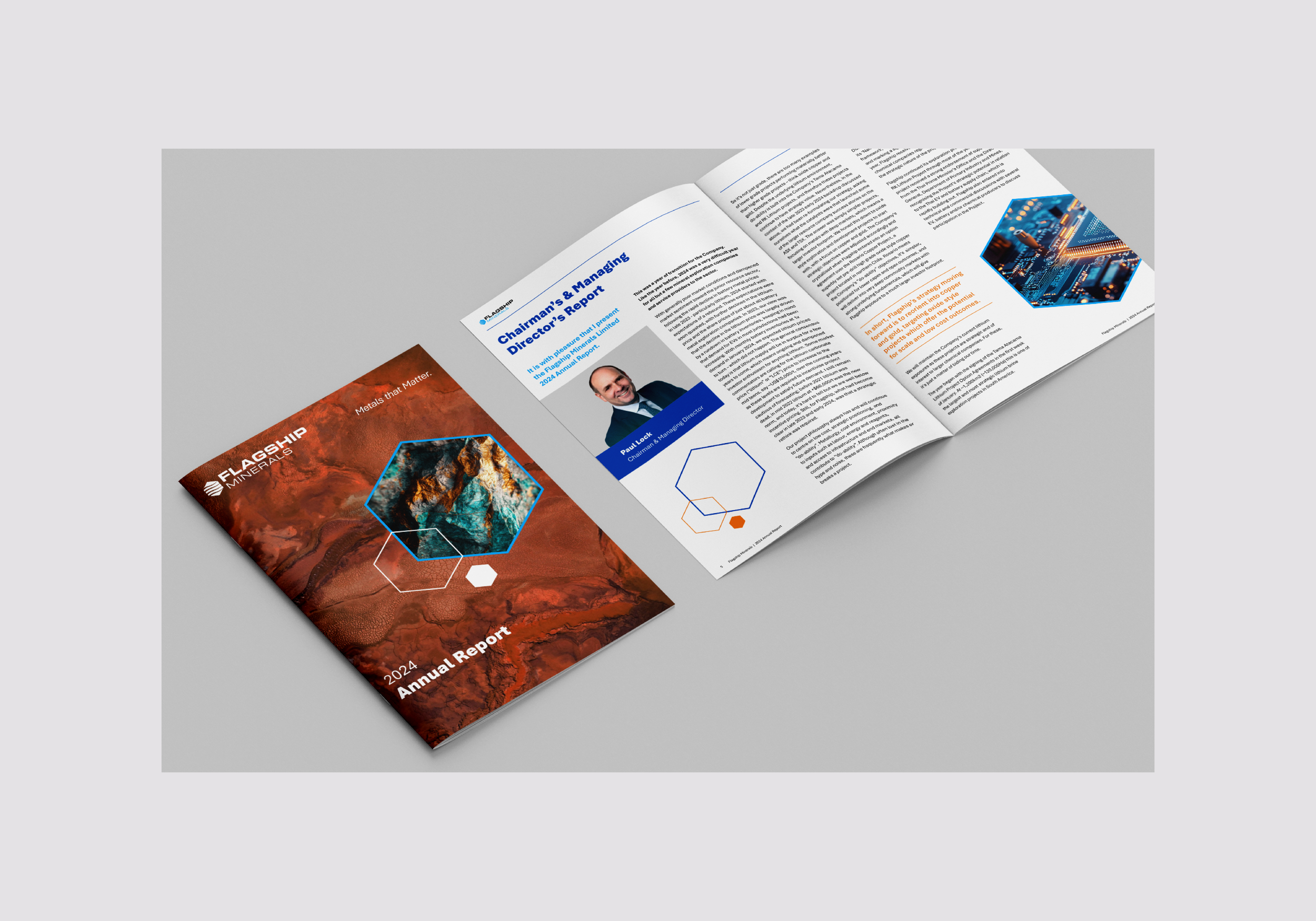
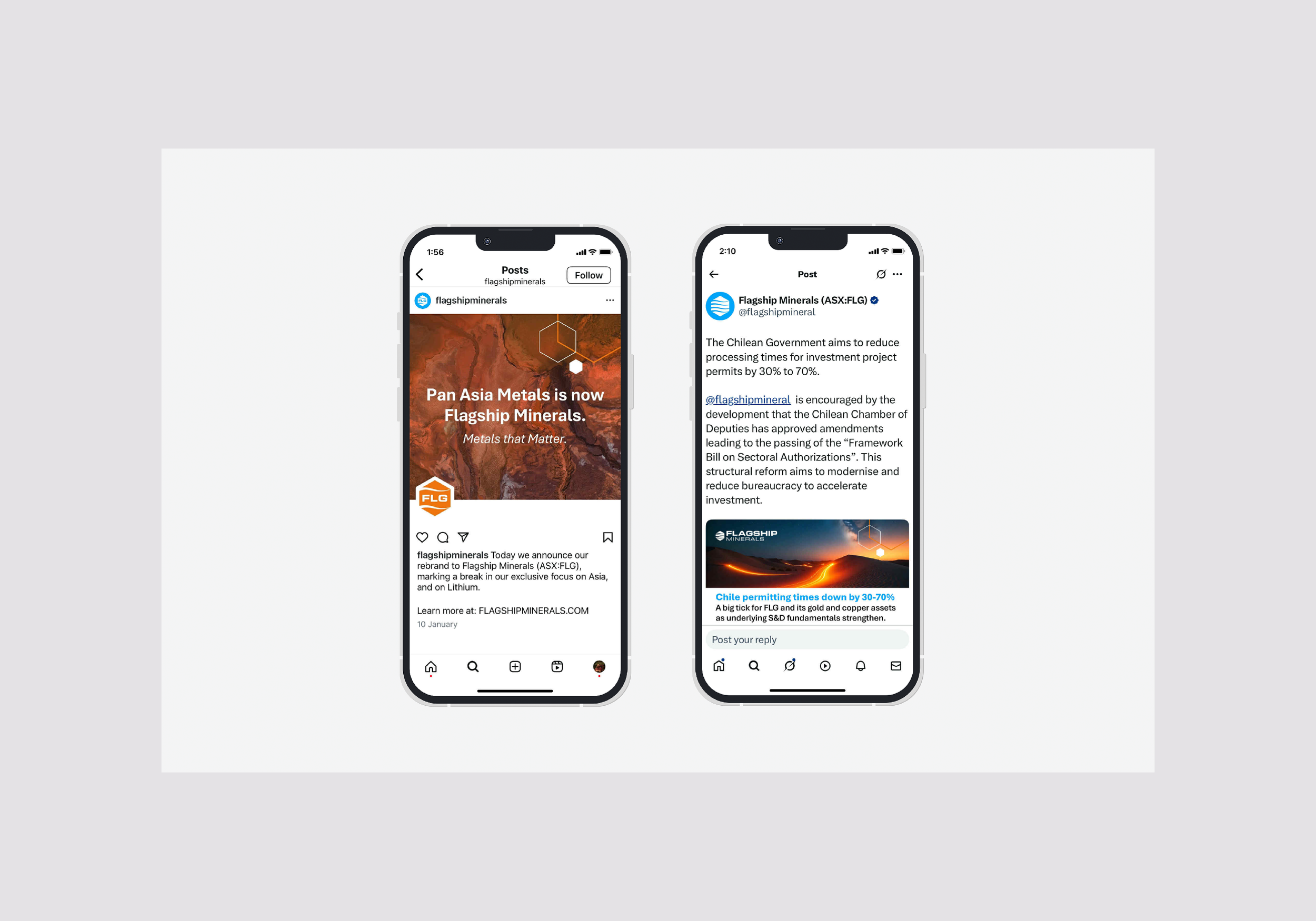
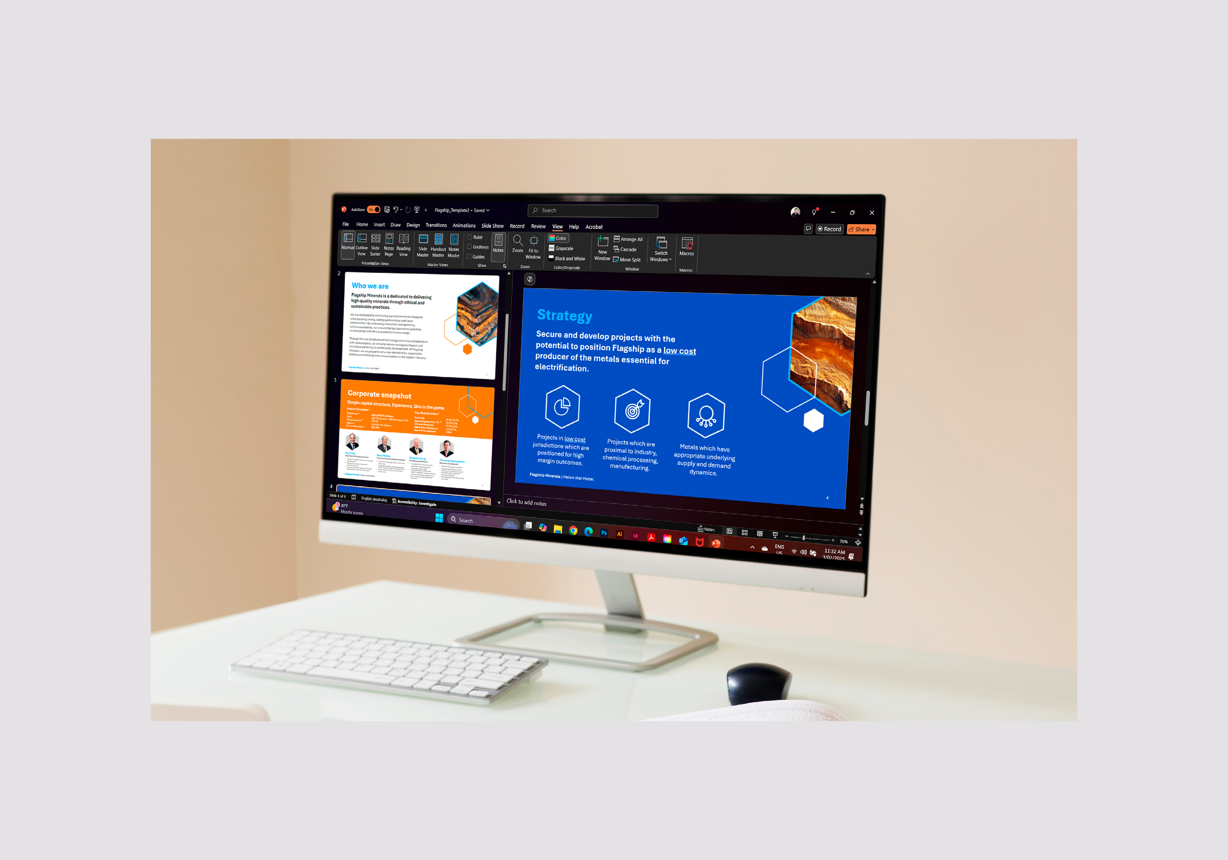
The new identity was implemented across social media, digital platforms, presentations, annual reports, and internal materials.