Hoyts Cinemas
Logo | Branding | Print | Packaging | Environmental
As Art Director at Hoyts Cinemas, I led the first major refresh of the brand’s logo and identity since 1975. The goal was to modernise the visual language while respecting its heritage. The iconic Hoyts red was preserved and a custom sans-serif typeface introduced, incorporating subtle film strip-inspired squares as a nod to the brand’s cinematic roots. The outcome was a sleek, contemporary identity that seamlessly connected Hoyts' legacy with its future. I also oversaw the in-house studio and managed the brand rollout across the entire cinema chain, delivering a cohesive visual presence through all forms of advertising and marketing.
The updated Hoyts logo on the pre-screening ident amplified brand impact, delivering a bold and instantly recognisable visual signature before each movie.
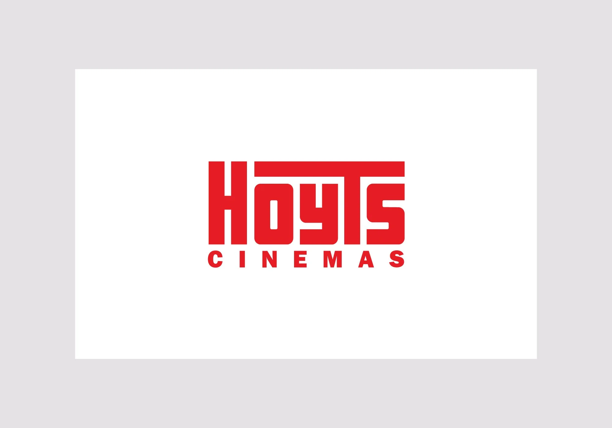
The original logo used prior to the rebrand.
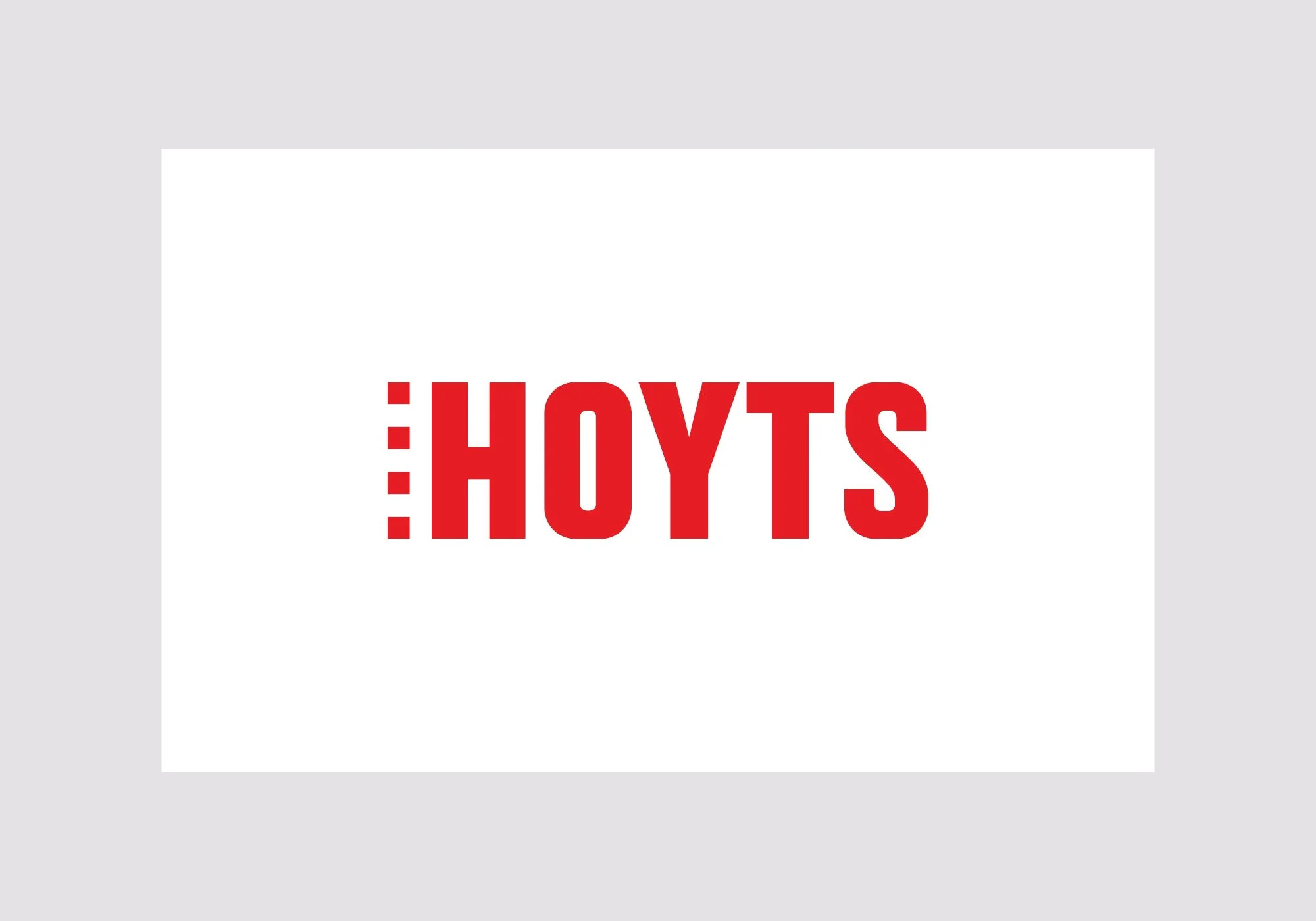
The evolved design highlights the shift from an outdated aesthetic to a modern, confident brand mark.
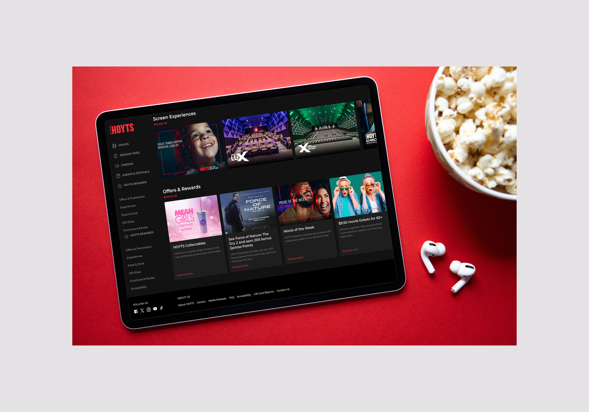
The refreshed logo delivers a bold, easily recognisable brand identity featuring Hoyts’ iconic red. As a leading brand in Australia and New Zealand, Hoyts maintains a prominent presence across both markets, ensuring strong visibility and immediate recognition among consumers.

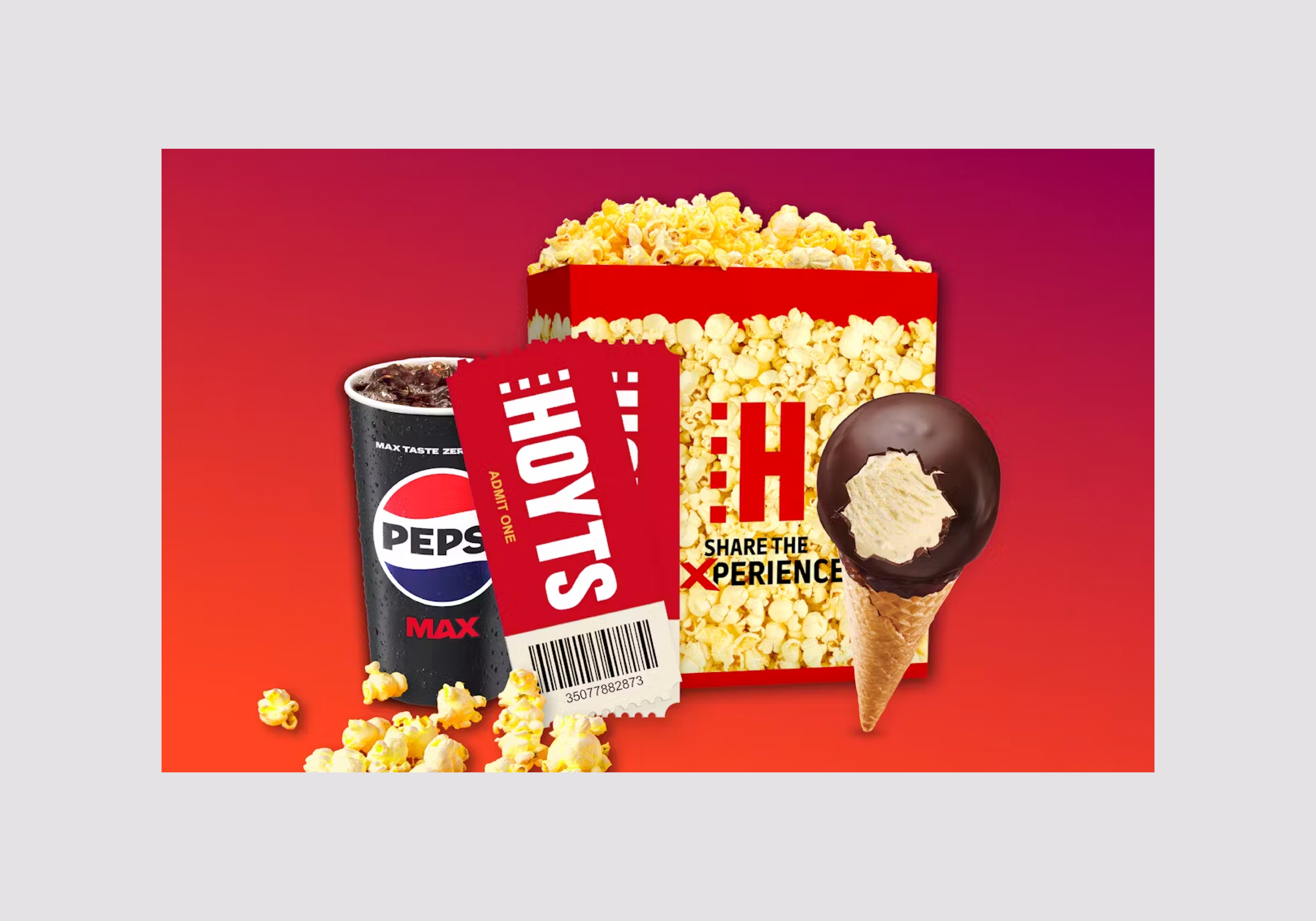
The logo features prominently across all marketing assets, including gift cards, candy bar packaging, and other branded materials, ensuring strong brand recognition and a cohesive visual identity.

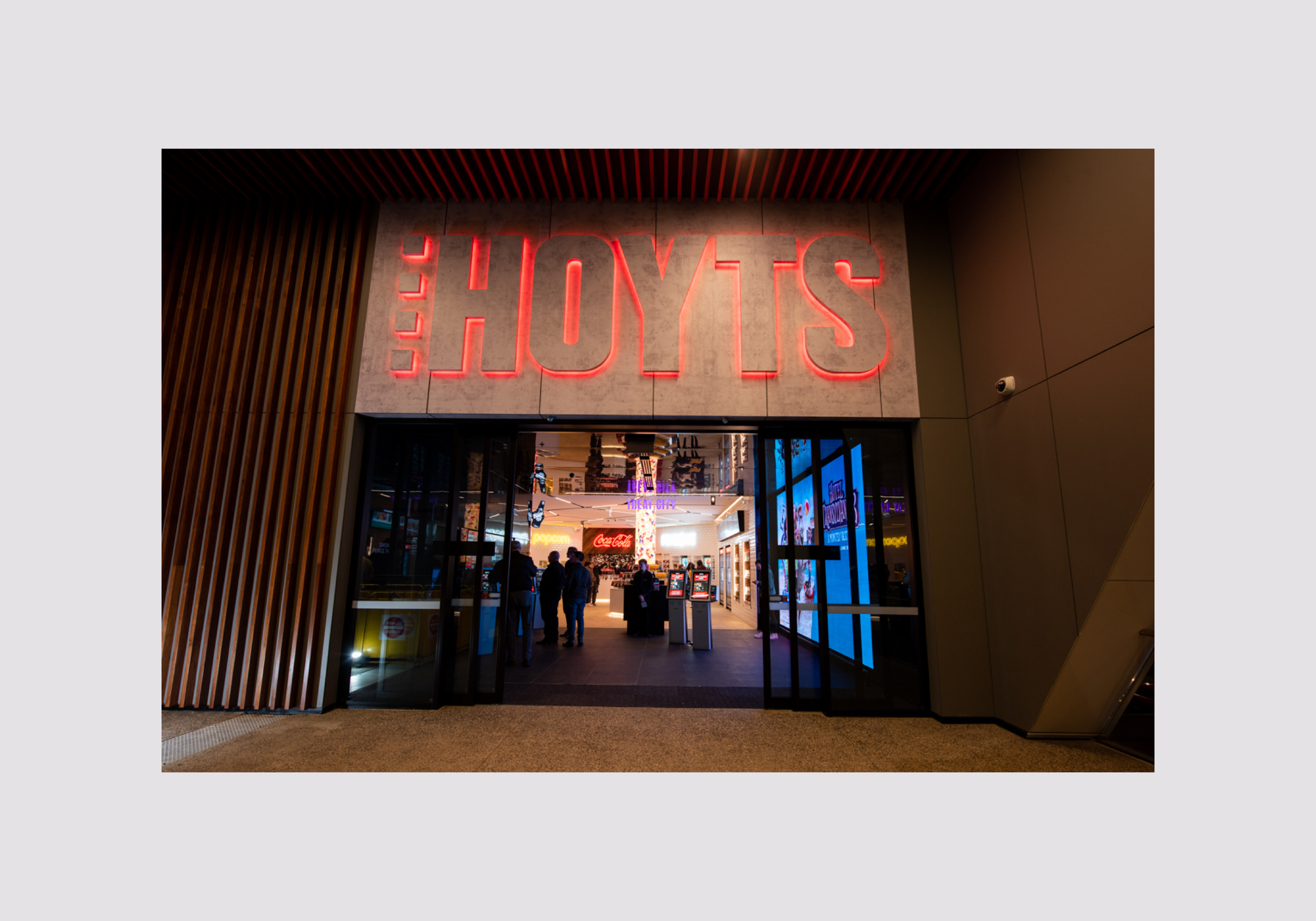
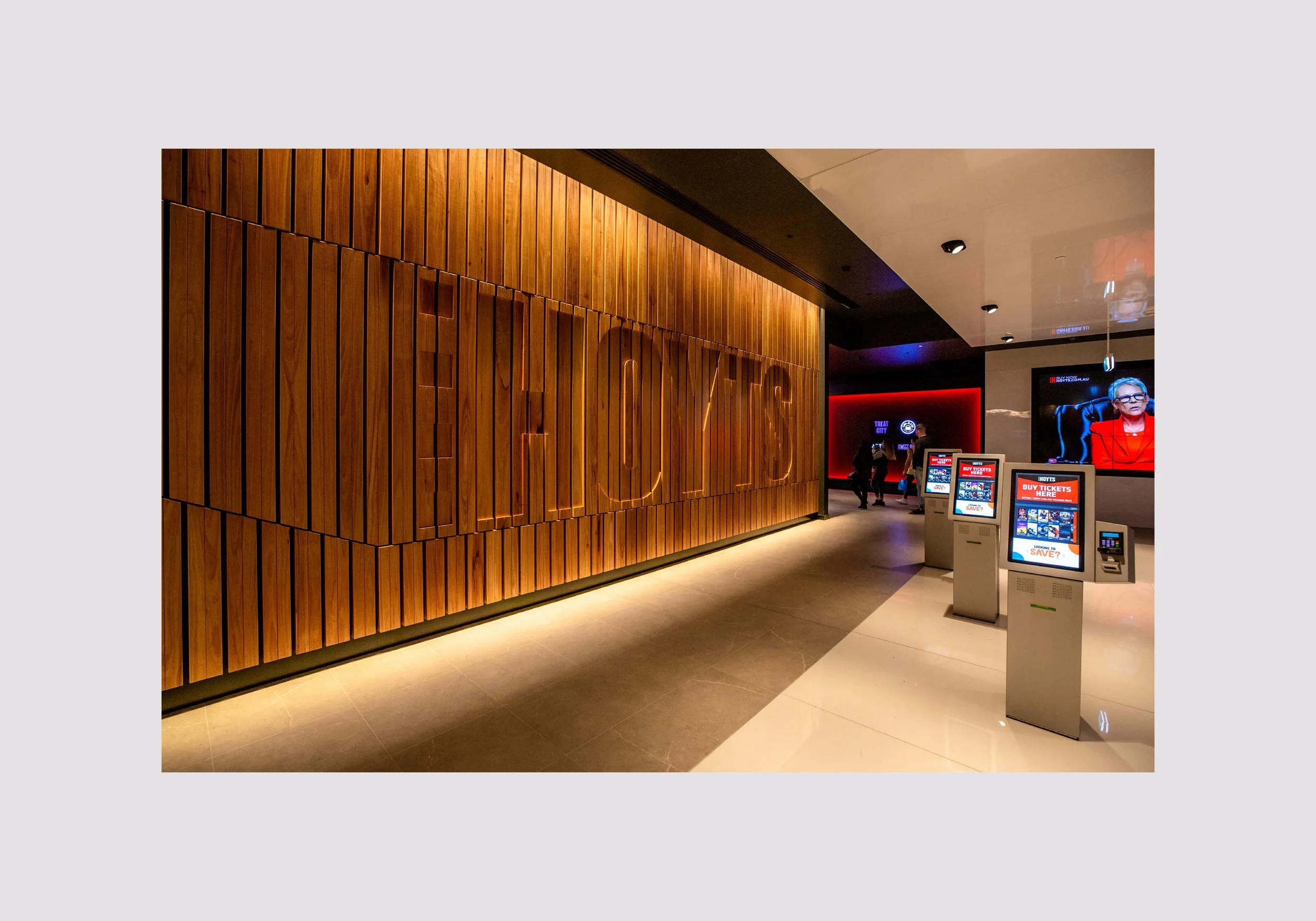
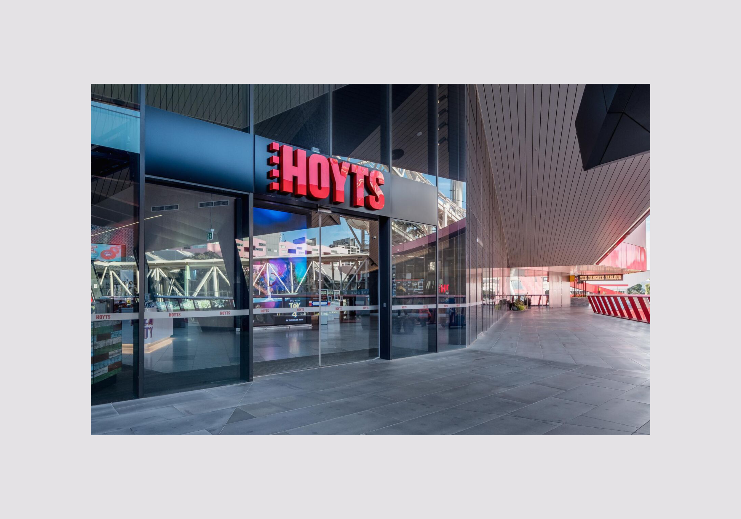
Prominently displayed in large format at cinema locations and environmental spaces, the Hoyts logo commands attention and reinforces brand recognition.